As I was preparing for a BigQuery attribution workshop, I started thinking: how can we simplify calculating and analyzing user-based metrics to make it as clear and convenient as possible? That’s when I came up with an approach that quickly evaluates metric distribution by customer, giving you an instant look at who’s driving the majority of revenue.
This method, using GA4 data in BigQuery, makes it easy to understand how revenue is distributed across your user base. Here’s how to set it up:
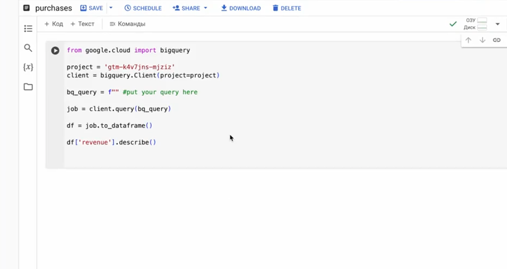
1. Create and save a Notebook: open the Notebooks tab in BigQuery, create a new notebook, connect BigQuery, and save it. This way, you’ll have quick access to the notebook anytime you want to refresh your analysis.
2. Prepare an SQL query: write a query to aggregate revenue (or any other metric) by customer. This query will calculate the metric total for each user_id or user_pseudo_id.
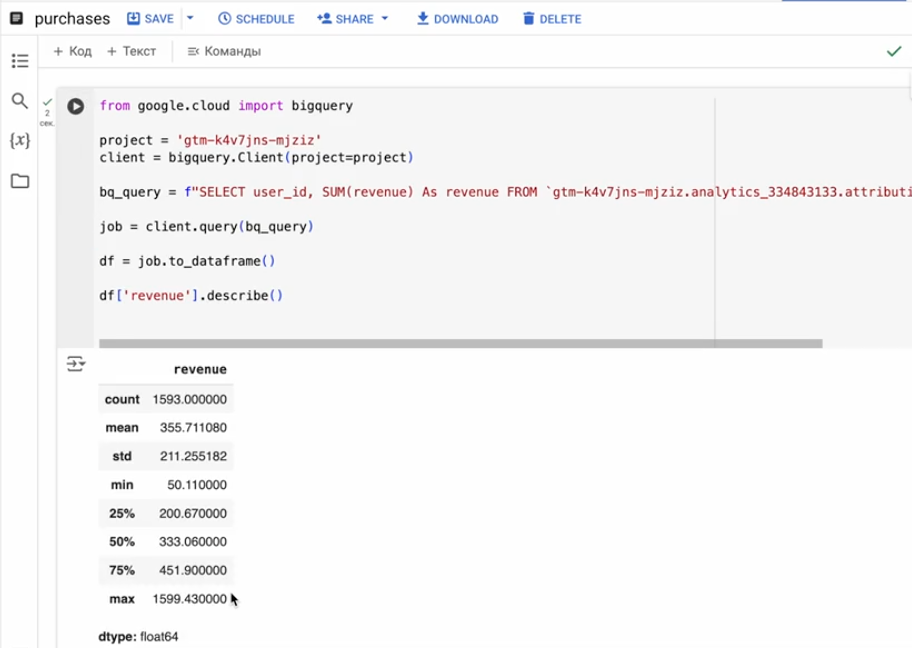
3. Run the Notebook and use describe() for analysis: execute the query, load the results into Python, and use the describe() method to assess the distribution.
What does describe() show?
The describe() method provides key stats for the metric, including:
count — the number of users
mean — the average revenue per user
std — standard deviation, showing value variability
min, 25%, 50% (median), 75%, max — key percentiles to gauge the range and spot outliers.
The notebook code is very simple, as you can see. To make this process even easier, save the notebook in advance in BigQuery’s Notebooks tab. This allows you to quickly access it for any updated data analysis with a single click.

Want to get all my top Linkedin content? I regularly upload it to one Notion doc.
Go here to download it for FREE.


