Optimizing forms on your website is crucial for maintaining a good UX. Eliminate anything that might confuse users or, worse, make them leave – this is half the battle in the conversion optimization process.
Form optimization isn't rocket science; the key is not to overcomplicate things.
Popular Form Optimization Tactics:
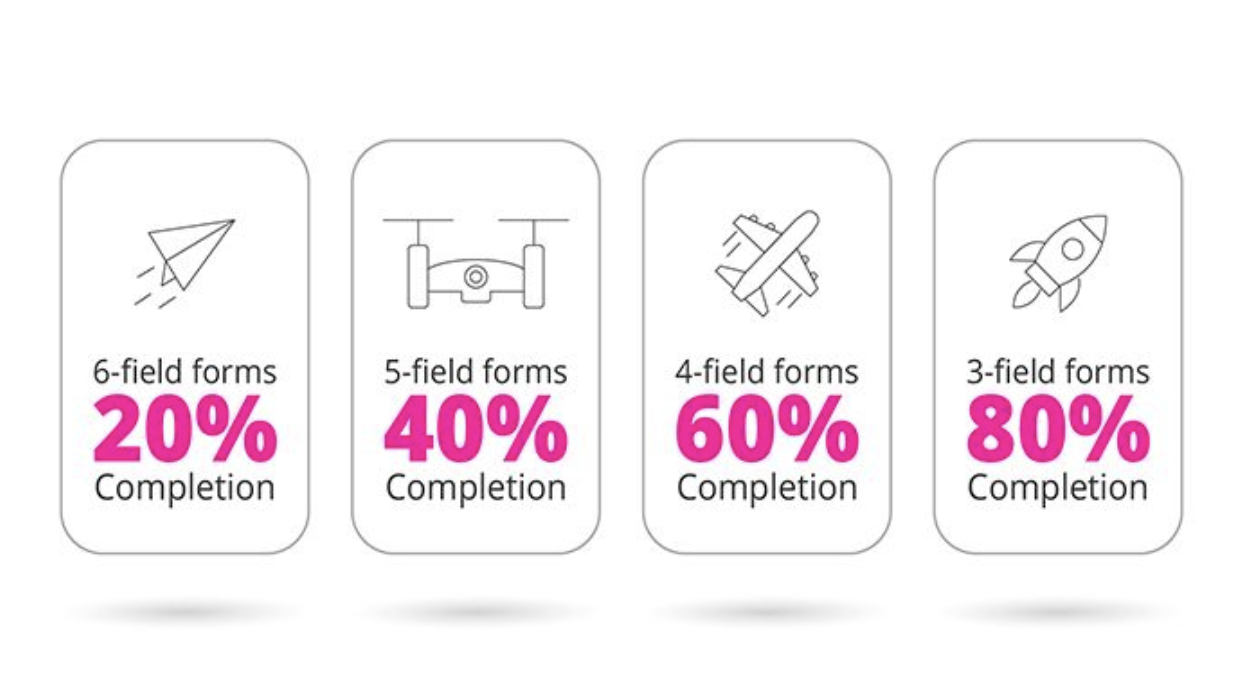
1. Minimize the Number of Fields: Simplify the filling process. Note: If you’re a B2B SaaS company, reducing fields might not always be the best advice.
2. Use Hints: Include both browser-based and custom hints to make input easier and reduce cognitive load.
3. Responsive Design: Ensure your forms are easy to fill out on any device, including mobile.
4. Masks and Validation Tools: Use real-time validation to check for errors as users enter data. This is especially helpful when you know the country code or language your users will be using.
5. Feedback After Submission: Provide clear and understandable feedback after a form is successfully submitted. This reduces frustration and shows you care.
6. Localization: Ensure that hints, placeholders, and button texts are all in the same language.
Additional Tactics:
1. Clarity and Simplicity: Forms should be as straightforward and intuitive as possible.
2. Indicate Required Fields: Clearly mark which fields are mandatory.
3. Optimize the Submit Button: Make the submit button visible and attractive, but don’t over-optimize it.
Form optimization is a crucial part of your overall CRO strategy. Simplifying the form-filling process can lead to significant increases in conversion rate.
You can download my GA4-BigQuery Cheat Sheet here.


